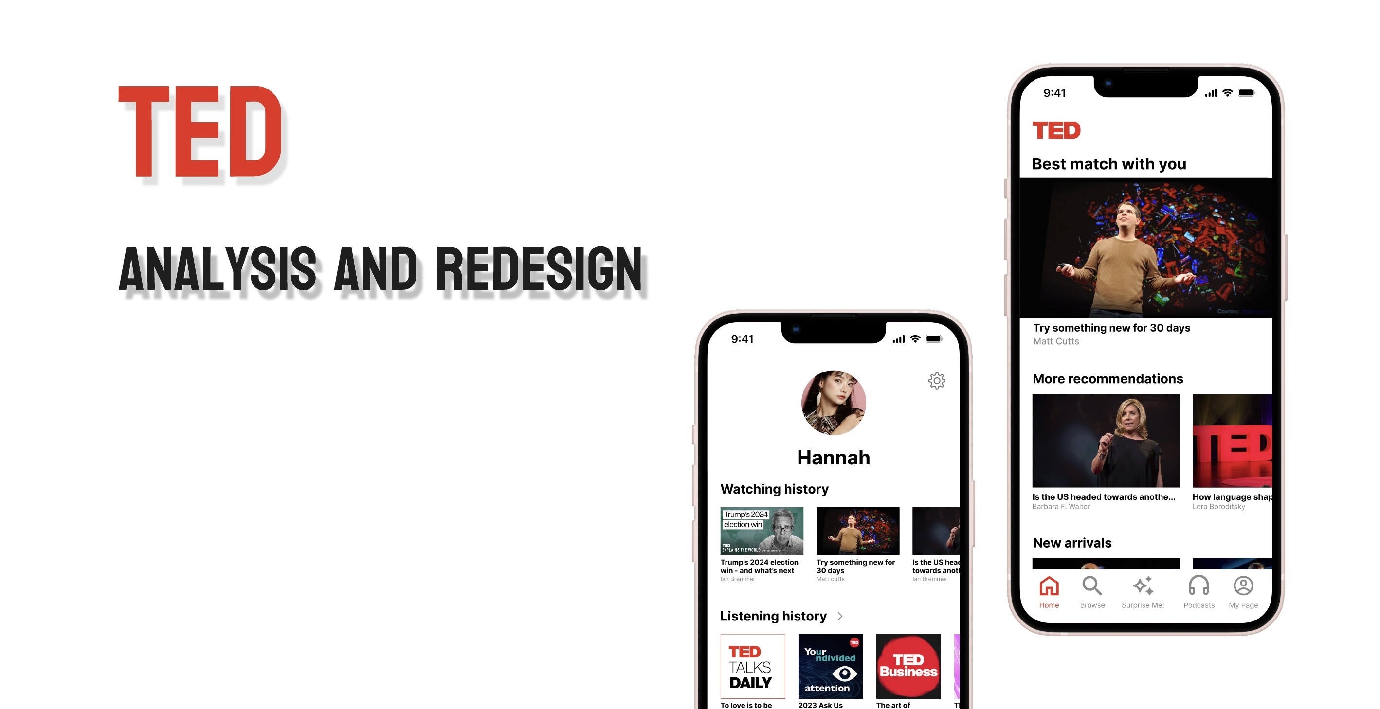
overview
Challenge
TED is the famous non-profit organization known around the world and the mobile app is categorized as Education because it is understood as a good platform for study the contents, how to do the presentation, and English. However, there were some uncomfortable UX and UI designs on the mobile version, so I aimed to improve them by setting the User Persona, focusing on the original and future User Journey, and emotional changes.
duration
December 9th to 18th in 2024
tools
Sketch, Figma
task
Identified Pain Points and how to address them,
Wireframing, Prototyping, Analysis
User persona
Hannah (25), Japanese
Hannah is using TED to study English without going outside of Japan.
She needs some comfortable service for exciting studying,
such as attractive or motivational phrases
for video categories, subtitles, transcription, and sharing with study friends.
Those factors can be connected with enjoying and continuing to study and use this app.
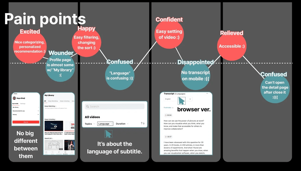
User journey / Pain points
Browsing
Excited: the clear categories, choosing the videos
Wonder: the profile part on the home page and the “My Library” page are almost the sameSearching
Happy: the easy filtering and changing of the sort Confused: the unclear of “Language” option is for speakers or subtitlesWatching
Confident: the setting of the video
Disappointed: no service of the transcript, which follows the video progress at the same time and browser providesSharing
Relieved: the easy access to the sharing page
Confused: the flow to back to the detail page after moving to another page despite the mini player working↓↓↓↓
Pain Points
Confusion about the difference between
My profile and My LibraryConfusion about the Language option on the search page
Lack of transcript
Rough flow to back to detail page after moving away See the pain point


Ideation
Confusion about the difference between
My profile and My Library
→ Combine the Profile and My Library pagesConfusion about the Language option on the search page
→ Change the phrase of filter “Language” to “Subtitle language”Lack of transcript
→ Add the transcription on the detail pageRough flow to back to detail page after moving away
→ Create the flow back to the detail page
after closing the full screen and when
the mini-player is opened

Prototype
This prototype video shows the ideation as a solution in the order of;
Combine the Profile and My Library pages
Change the phrase of filter “Language” to “Subtitle language”
Add the transcription on the detail page
Create the flow back to the detail page after closing the full screen and when the mini-player is opened
In addition, I changed some phrases for the categories on the home screen
to make it more attractive to the audience.
Prototype from here
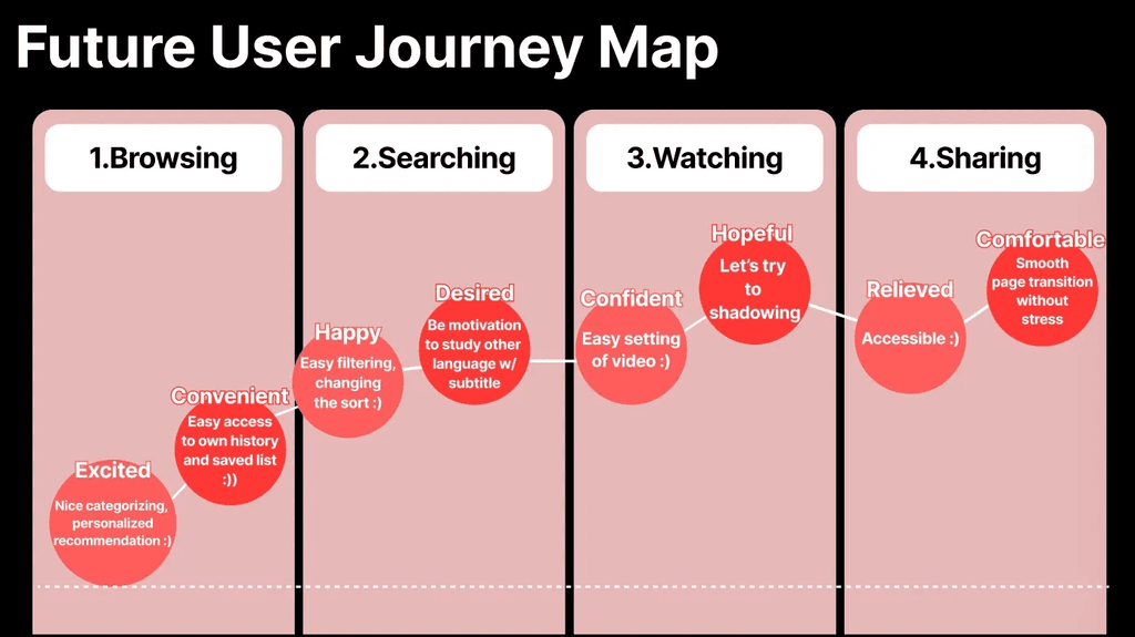
Future User Journey Map
Wonder>>Convenient
the profile part on the home page and the “My Library” page are combinedConfused>>Desired
the phrase change from
“Language” to “Subtitle language”Disappointed>>Hopeful
adding transcriptionConfused>>Comfortable
no stress of page transition
Future actions
Use “Subtitle” instead of “Subtitle language” as ideation 2
… because the mobile design has limited space
>> It is important to design with an understandable but short phraseUse animation for the transcription function
>> While my design is still limited, every solution will improve the user experience