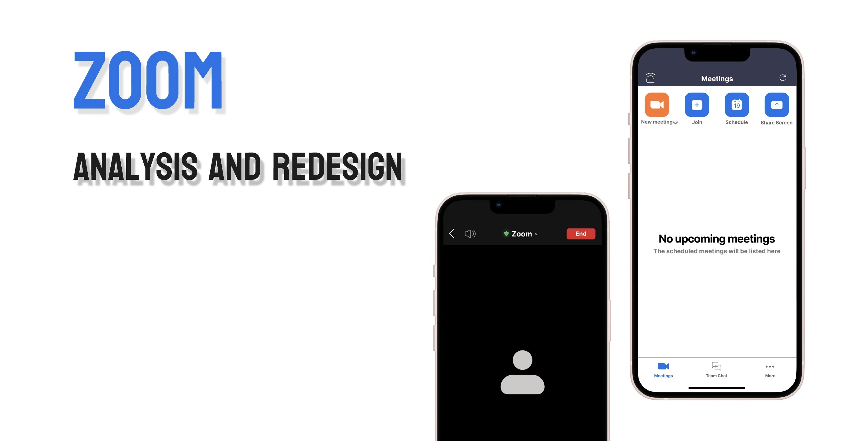
overview
Challenge
Since COVID-19, Zoom has become widely used for education and business across various platforms, with mobile accessibility being a key advantage. However, the mobile app faces UI/UX issues not seen in desktop or browser versions regarding whether they followed the “Shneiderman’s Eight Golden Rules”. To address this, I aimed to develop improvements for more comfortable usability.
duration
October in 2024
tools
Sketch, Figma
task
Identified Pain Points and how to address them,
Competitive Research, Wireframing, Prototyping,
User Testing, Analysis
Usability issues
Strive for consistency; The difficulty of creating the personal link
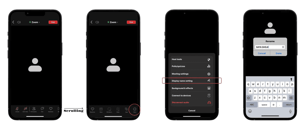
Frequent users to use shortcuts; The difficulty of changing the “display name” during the meeting
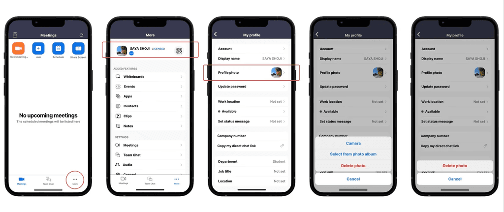
Keep users in control; No option for deleting the profile picture


Proposed solutions
One small arrow is set under the New Meeting icon on the home screen to avoid confusion regarding the icon when creating the personal link
Prototype from hereThe option to change the display name is set in the “More” section instead of tapping your own name in the “Participants” section
Prototype from here
The option to delete the profile photo was added to the same feature as changing the profile photo Prototype from here

Usability testing
method
Issue 1 and 2… Time on Task
Issue 3… Task Success Rate
Targets
3 international students in Tamwood carrer A, B, C

results
issue 1
User A took longer, and B and C took shorter on the developed version
>> The importance of the size balance between letters and icons, especially for mobile apps, and it is better to create a clear button or feature for selecting the option rather than just a small guide

issue 2
User A and B took longer, and C took shorter on the developed version
>>The solution was not bad, however, the testing order of the original and developed one was also important and affected the result

issue 3
100% of subjects succeeded
>>the solution provide a good U and one of the big reasons for this success was the same flow as other applications such as WhatsApp, Instagram, or Google, which reminds users of common sense when using it
insights
The size balance between letters and icons, especially for mobile apps
The order of the testing, original and developed, was also important and affected the result
Incorporating similarities with other apps is an effective strategy